Access the logos, messaging and visual standards you need to represent Health Alliance Plan accurately and consistently. Questions? Contact brand@hap.org.
Disclaimer: All Health Alliance Plan branded materials require Marketing review and approval. Please work with your Health Alliance Plan contact to begin the process.
Name usage guidance
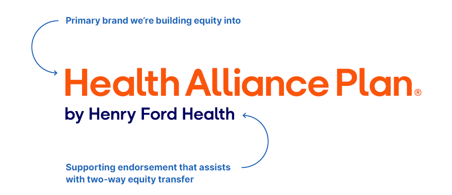
Use Health Alliance Plan by Henry Ford Health on first mention.
After that, use Health Alliance Plan or appropriate we/our pronouns.
*For headlines where space is limited, use Health Alliance Plan or we/our pronouns, then include the full name in the supporting copy.
If the logo appears in the communication, it serves as the first full-name mention. Subsequent mentions may use Health Alliance Plan.
Logo configurations
Horizontal
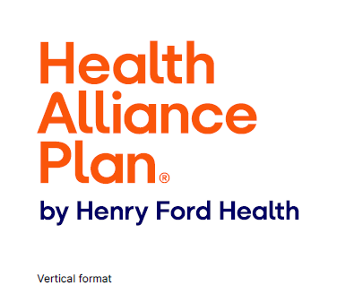
Vertical
Clear space and minimum size
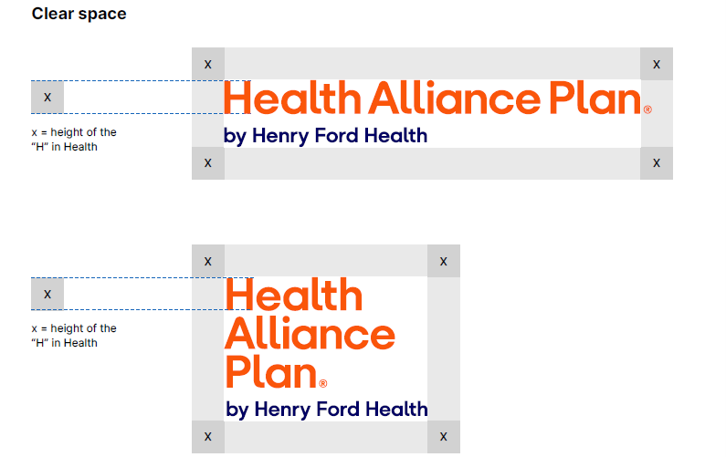
Clear space
Keep our logo clear and visible. Do not crowd it. That means no text, graphics or design elements inside its clear space. The clear space around all sides of our logo should be equal to the height of the “H” in Health.
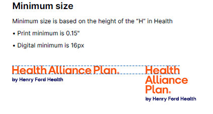
Minimum size
Our logo flexes to fit wherever it shows up, but it should always stay clear and easy to read. To protect its legibility, we’ve set minimum sizes based on height of the “H” in Health.
- For print applications, the minimum size of the “H” in Health is 0.15" high.
- For digital applications, the minimum size of the “H” in Health is 16px high.
*Clear space rules apply to standard and large-scale applications. For small-format merchandise (e.g. key fobs, pens, USBs), clear space may be reduced at production discretion. Never reduce our logo below minimum size requirements, even on these items.
Color formats and backgrounds
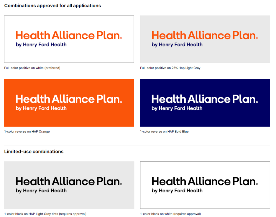
Combinations approved for all applications
Full-color logo on white (preferred)
Full-color logo on 25% Light Gray
1-color reverse logo on Orange
1-color reverse logo on Bold Blue
Limited-use combinations
1-color black logo on Light Gray tints (requires approval)
1-color black logo on white (requires approval)
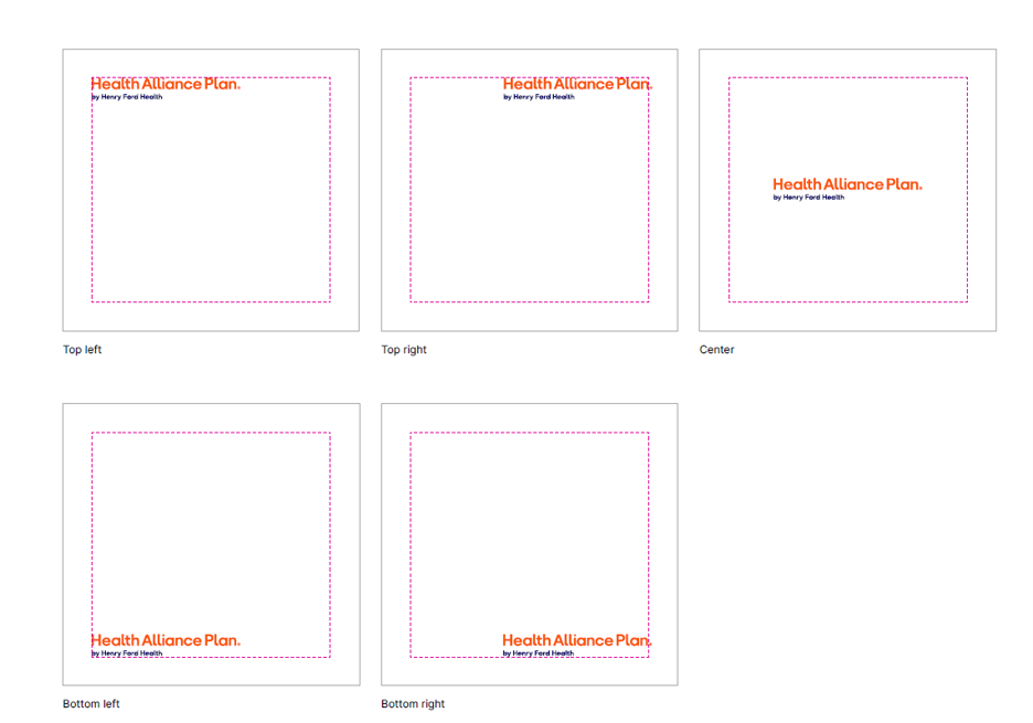
Logo placement
Place the logo with intention and allow adequate space for it to be clearly visible. It may be positioned in any corner or centered within a layout, provided it sits within the margins and maintains the required clear space on all sides.
Avoid crowding or placing the logo near competing elements. Its placement should feel balanced, legible and easily recognizable—never forced or constrained.
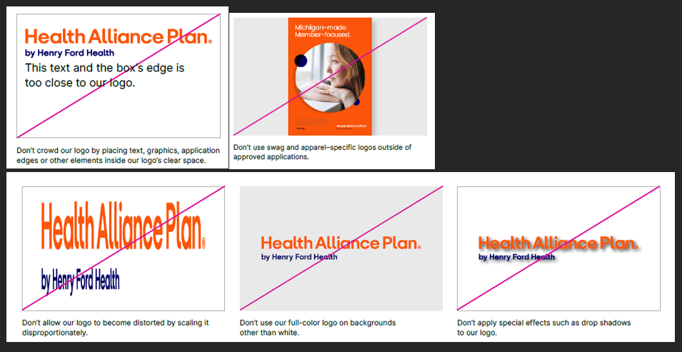
Logo misuses
Don’t crowd our logo by placing text, graphics, application edges or other elements inside our logo’s clear space.
Don’t allow our logo to become distorted by scaling it disproportionately.
Don’t use our full-color logo on backgrounds other than white.
Don’t use swag and apparel-specific logos outside of approved applications.
Don’t apply special effects such as drop shadows to our logo.
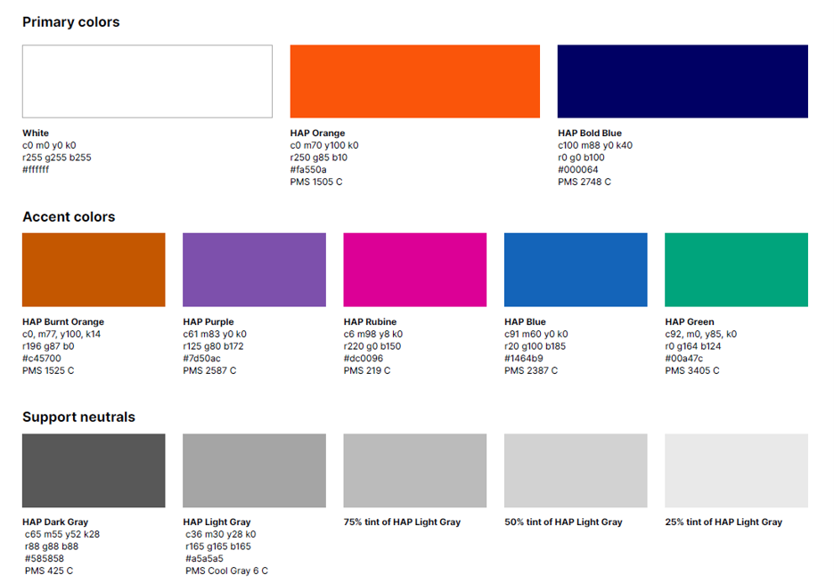
Lead with our primaries: White, Orange and Bold Blue. Use them on every layout to create contrast and recognition.
Let white do the work: White space keeps content clear and easy to navigate. It often carries more impact than color.
Use accents with intention: Choose one accent color per layout (outside of charts). It should support—not compete.
Keep neutrals in the background: Grays are for structure and readability, especially in text-heavy moments.
Always pair tints with full-saturation colors: Our full-saturation colors are what people recognize first. Use tints sparingly and always pair them with the full color.
Formulas and specifications
Use the formulas on this page to keep our colors consistent.
These specifications ensure that every application, print or digital, reflects our brand clearly and accurately. Always use the correct CMYK, RGB, HEX or PMS values for the intended output.
CMYK and PMS are used for print media.
RGB and HEX are used for digital media.
Misuses
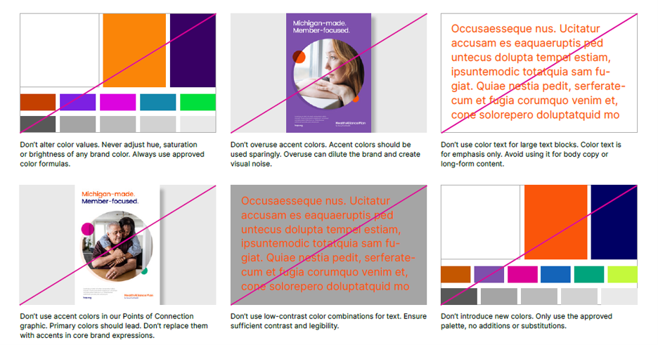
Keep our colors working the way they should. Avoid common missteps that can distract from, compete with or dilute their impact across applications.
Don’t alter color values. Never adjust hue, saturation or brightness of any brand color. Always use approved color formulas.
Don’t overuse accent colors. Accent colors should be used sparingly.
Don’t use color text for large text blocks. Color text is for emphasis only. Avoid using it for body copy or long-form content.
Don’t use accent colors in our Points of Connection signature graphic. Primary colors should lead. Don’t replace them with accent in core brand expressions.
Don’t use low-contrast color combinations for text. Ensure sufficient contrast and legibility.
Don't introduce new colors. Only use the approved palette, no additions or substitutions.
Brand typefaces
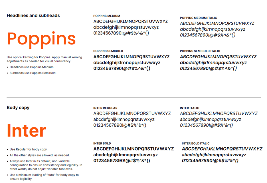
Poppins leads the way.
Headlines use Poppins Medium.
Subheads use Poppins Semibold.
Use optical kerning for Poppins. Apply manual kerning adjustments as needed for visual consistency.
Use Inter Regular for body copy.
All other styles are allowed as needed. (Inter Italic, Inter Bold, Inter Bold Italic.)
Always use Inter in its default, non-variable configuration to ensure consistency and legibility. Do not adjust variable font axes.
Use minimum leading of “auto” for body copy to ensure legibility.
System typefaces
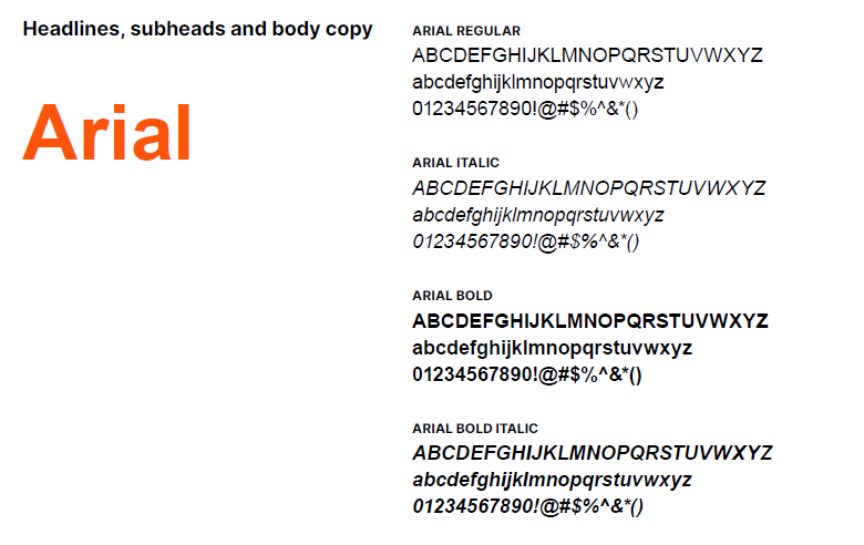
Use Arial as a system-installed option in Microsoft Word, PowerPoint, Excel or email.
For CMS-approved letters and forms, use the font and font size dictated by CMS. That information will be in the instructions provided by CMS.
For headlines, subheads and body copy use Arial Regular, Arial Italic, Arial Bold and Arial Bold Italic.
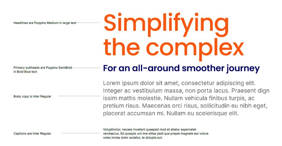
Sample hierarchy and core principles
Headlines are Poppins Medium in large text.
Primary subheads are Poppins Semibold in Bold Blue text.
Body copy is Inter Regular.
Captions are Inter Regular.
Accessibility considerations: Use a minimum type size of 11 pt font to meet compliance guidelines.
Misuses
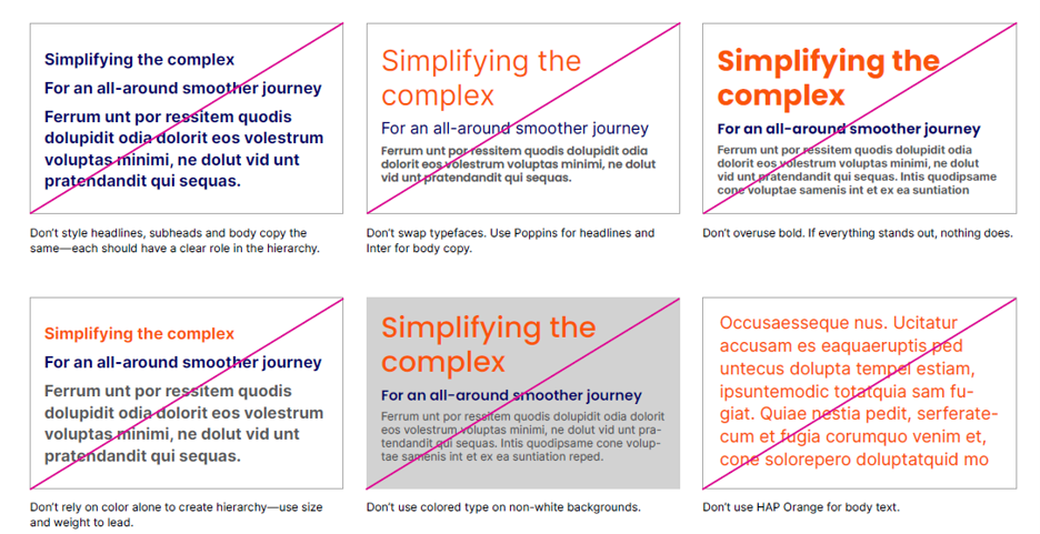
Keep type consistent and clear. Avoid common missteps that disrupt hierarchy, readability and overall cohesion.
Don’t style headlines, subheads and body copy the same. Each should have a clear role in hierarchy.
Don’t swap typefaces. Use Poppins for headlines and Inter for body copy.
Don’t overuse bold. If everything stands out, nothing does.
Don’t rely on color alone to create hierarchy. Use size and weight to lead.
Don’t use colored type on non-white backgrounds.
Don’t use Orange for body text.
Style and key principles
We use photography as a primary storytelling element. Our photography should always feel candid, authentic and never staged. It should:
Capture candid, unscripted moments that feel natural and authentic.
Keep people at the center of every shot.
Use warm, natural light to create a sense of approachability.
Simplify surroundings to reduce distraction and elevate the subject.
Look for meaningful moments as they happen.
Reflect real, diverse experiences across our communities.
The photos shown here are for visual style and tone. Photographing actual members, clinicians and employees is preferred instead of using stock photography. If a custom photoshoot cannot be arranged, the use of stock photography is permitted as long as the photos adhere to the above guidelines.
Misuses
Avoid common pitfalls that make the photography feel staged, distant or out of sync.
Don’t feature people who are looking directly at the camera.
Don’t use imagery that feels overly staged or posed.
Don’t use imagery that is visually cluttered.
Don’t feature subject matter that is graphic in nature.
Don’t use imagery that depicts suffering or negative side effects.
Don’t use imagery with futuristic special effects or add effects to approved images.
Don’t use imagery with unnatural lighting.
Don’t use duotone imagery.
Don’t use black-and-white imagery.
Points of connection overview
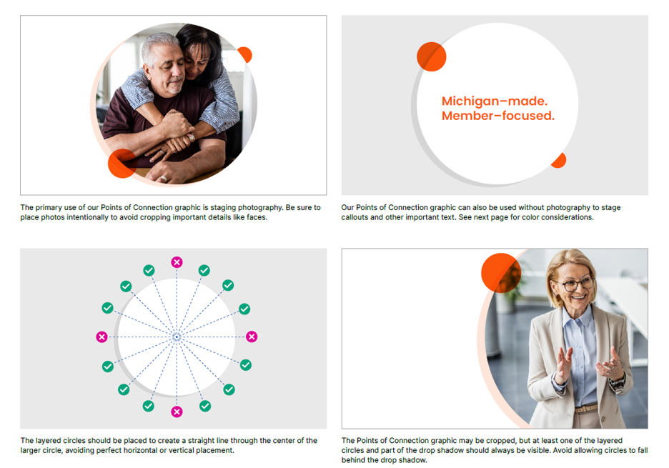
Points of Connection is our signature graphic device, designed to focus attention and bring key moments forward. Think of it as the visual manifestation of what we do every day: connect members to the care, support and answers they need, without hesitation.
Anatomy
At the core of our Points of Connection device is a large circle—used to highlight photography or important callouts. It grounds the layout and draws the eye to what matters most. A subtle drop shadow in 10% Orange with no blur adds depth without distraction.
Two smaller circles layer over the primary shape, creating movement and reinforcing the idea of connection across the experience.
Style and key principles
Use Points of Connection with intention. Follow these principles to help keep it clear, focused and consistent across every application.
Color considerations
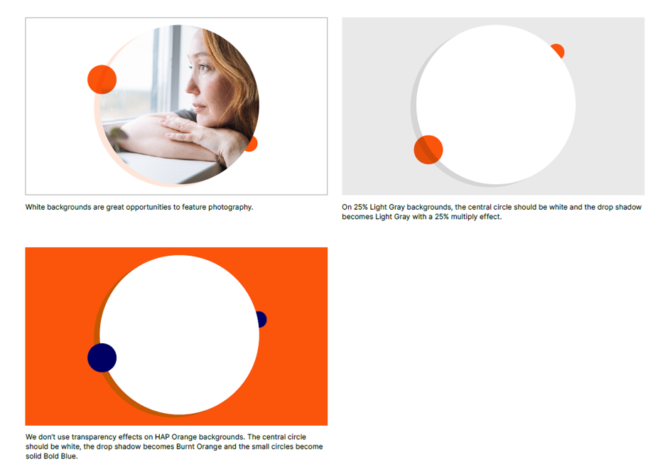
Points of Connection draw the eye and highlight what matters most. We most often use them on white backgrounds, but they can also be used on Orange, 25% tint of Light Gray and Bold Blue backgrounds.
Logo colors
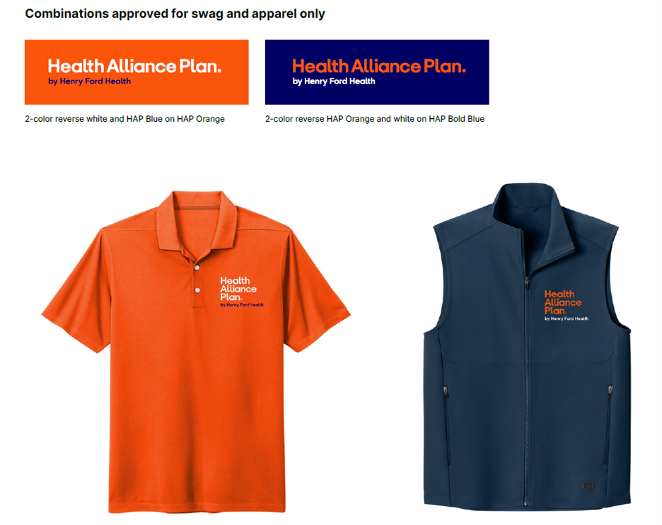
For swag and apparel, alternate logo versions are available that incorporate both our HAP Orange and Bold Blue. These variations are reserved exclusively for those applications, ensuring clear and consistent representation of both our our brand, "Henry Ford Health and Health Alliance TPA" brand, Henry Ford Health and Health Alliance TPA.
We use our logos with the registered trademark symbol (®) whenever possible. Only use the logo without it when production constraints such as small-scale embroidery prevent it from reproducing clearly.
Name
Usage guidance:
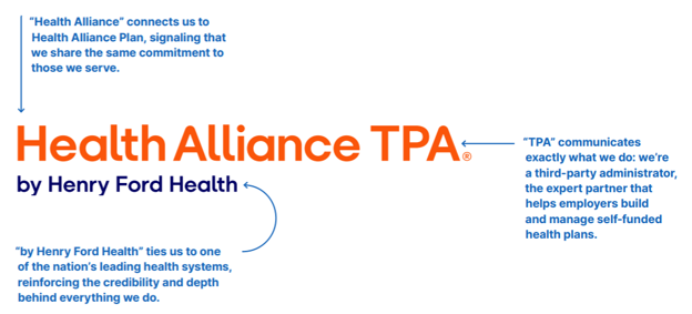
Use “Health Alliance TPA by Henry Ford Health” on first mention.
Use “Health Alliance TPA” on subsequent mentions.
Our relationship to Health Alliance Plan
Health Alliance TPA is a wholly owned entity and sub-brand within Health Alliance Plan Visual identity
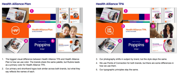
Health Alliance TPA is closely connected to the Health Alliance Plan brand, with a look and feel that’s intentionally familiar despite a few key differences that set it apart.
For all common elements, refer to our Health Alliance Plan guidelines.
Logo configurations
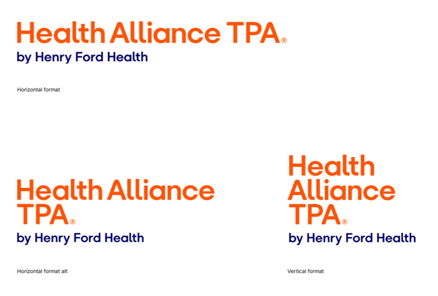
There are three configurations of our logo to provide flexibility for a variety of application needs.
Follow the clear space and minimum size, color formats and backgrounds, placement and misuses defined in the Health Alliance Plan guidelines.
Color principles
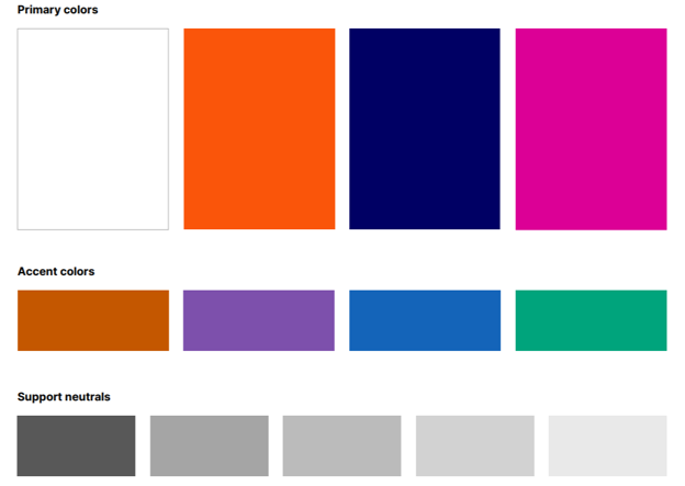
We share a color palette with Health Alliance Plan, but Rubine joins White, HAP Orange and Bold Blue as a primary color. All other color principles remain the same. See Health Alliance Plan guidelines for color formulas and misuses.
Photography style and key principles
Where Health Alliance Plan photography focuses more on everyday experiences, Health Alliance TPA photography focuses more on clinical and professional settings. All other photographic principles remain the same. See the Health Alliance Plan guidelines for misuses.
Capture candid, unscripted moments that feel natural and authentic.
Keep people at the center of every shot—they are the hero.
Use warm, natural light to create a sense of approachability.
Simplify surroundings to reduce distraction and elevate the subject.
Look for meaningful moments as they happen.
Reflect real, diverse experiences across our communities.
The photos shown here are for visual style and tone. Photograph actual members, clinicians and employees instead of using stock photography. If you cannot arrange a custom photoshoot, you may use stock photography, as long as the photos adhere to the above guidelines.
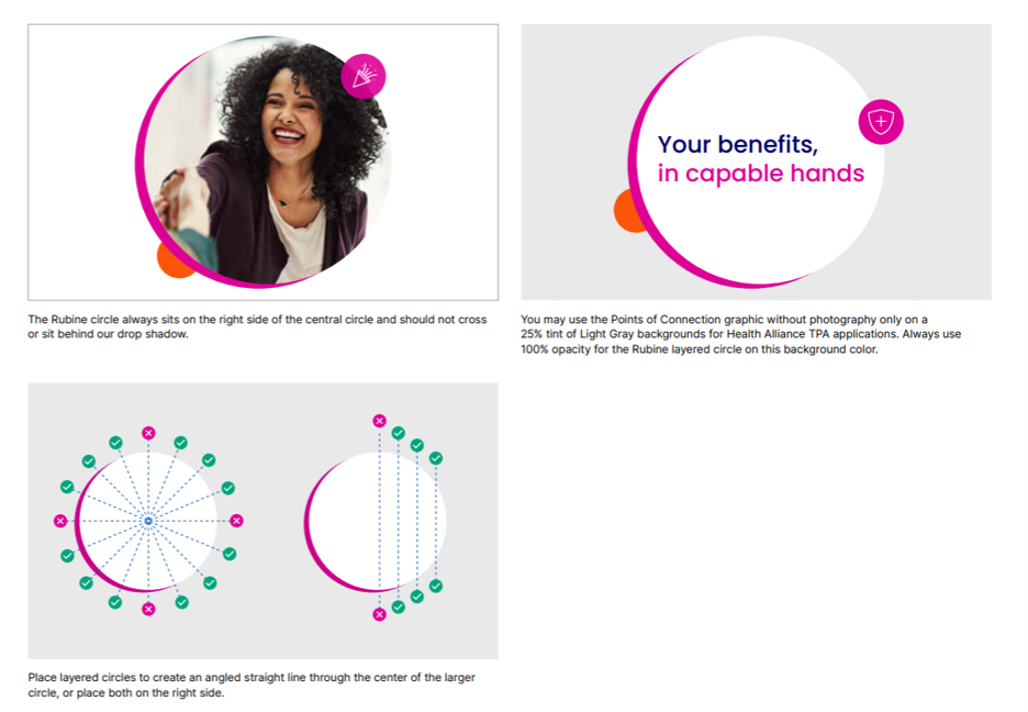
Points of Connection
The Points of Connection is Health Alliance TPA’s signature graphic, with a few differences from Health Alliance Plan. We’ve highlighted those differences here and on the next page. For everything else, follow the Health Alliance Plan guidelines.
(image)
Brand leadership
Health Alliance Plan by Henry Ford Health is the lead brand on all co-branded materials unless otherwise specified.
Vendor logos should always be positioned as secondary or supporting, unless a vendor-led approach has been explicitly approved.
All co-branded materials must follow Health Alliance Plan’s brand standards—including color palette, typography, photography style and overall visual guidelines—to ensure a consistent and unified brand expression.
Logo order and placement
The Health Alliance Plan logo must:
Appear first in reading order (left-to-right or top-to-bottom).
Be placed in the most prominent position within the layout.
Vendor logos should be placed:
Adjacent to or below the Health Alliance Plan logo.
In a clearly subordinate position.
Size and visual weight
The Health Alliance Plan logo must be equal to or larger than any partner/vendor logo
Vendor logos may match the size of the Health Alliance Plan logo in size only when equal-brand partnerships are agreed upon.
Vendor logos should never be displayed larger than the Health Alliance Plan logo unless explicitly agreed upon by both parties.
Spacing and separation
Maintain a clear space around each logo to preserve legibility and brand integrity.
Logos must not overlap or touch. They should not be combined into a single mark unless agreed upon by both parties.
Approval
All co-branded materials must be reviewed and approved by the Health Alliance Plan marketing team before distribution. Contact brand@hap.org for more information.